The Repot

 Prev
Prev
Contents
Jump To:
Link to Website:
Project Overview
The Goal
Design and build a responsive ecommerce website for The Repot, an online plant seller that allows users to easily browse plants and find the right one for their situation.
Nail down responsive web design, flexbox, css grid, animation, etc.
The Product
The Repot is an online plant retailer offering shippable plants, packaged safely, that can be shipped anywhere in the U.S. The target audience is 16-50 y/o renters and homeowners that are eco-conscious, consider themselves chic, and are primarily women, although it should feel friendly to men as well.
My Role
Everything from competitor and user research, creating the brand, ideating, designing, and coding the site.
Project Duration
July 2025
Understanding the User
Competitor Research
The assignment was to create a website for a product or service based on plants. I started by brainstorming 60+ ideas and went with a shippable plants ecommerce website.
I first researched shippable plants and conducted a competitive audit of similar services to learn about their branding and products.
I found that a lot of the competitors had similar design choices, like no border-radius, no drop-shadows, and a trendy serif header font. A common concern from customers was whether their plant was going to die during shipping.
Target Audience
Next, I identified the target audience for the brand and created personas to represent key user groups.


The target audience is 18-50 y/o homeowners and renters in America, primarily targeting eco-conscious, progressive-leaning younger women who consider themselves chic, trendy, and plant lovers, and have enough money to spend on delivered plants. While catering to this group, the site should feel friendly to men and more masculine people as well.
Starting the Design
Paper Wireframes
After researching, empathizing with the user, and defining goals, I moved on to sketching my designs. I started by sketching quick wireframes on paper to get all my ideas down and see which ones I liked.

Paper Sketches
I then took the ideas I liked and fully sketched them out to see what they would look like and presented these sketches to the professor and the class to get feedback before I moved on.
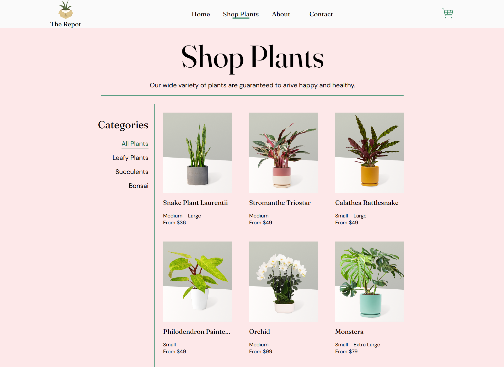
I included a popular products section near the top of the home page to give users a sense of what they'll find in the store.
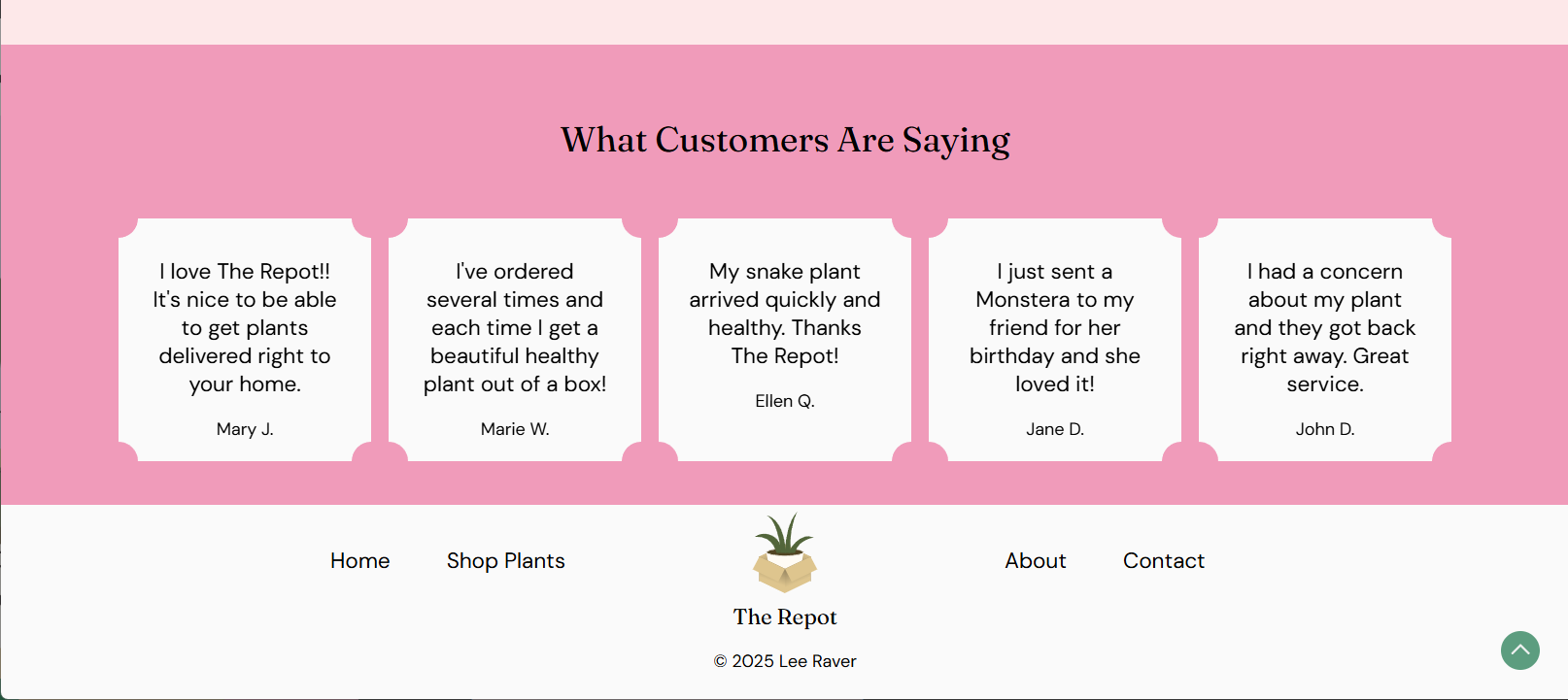
I included sections for shipping info and testimonials to reassure customers about the shipping process.

Based on the personas, I went with a bold pink and green color scheme that catered to the target audience while not being off-putting to potential male customers.

Refining the Design
Hi-Fi Sketches
Next I created high-fidelity sketches in Figma to nail down the finer details.

Going back to the competitor research, I designed the site to be unique and stand out, but made similar design choices like no border-radius or drop-shadows to make the brand fit into the existing space that customers were familiar with.

I presented these final sketches to the class to get feedback before moving on to coding. Some of the feedback I got was to make some of the colors in the lower sections match the hero section, and to make the text in the hero section have more contrast with the illustration behind it.

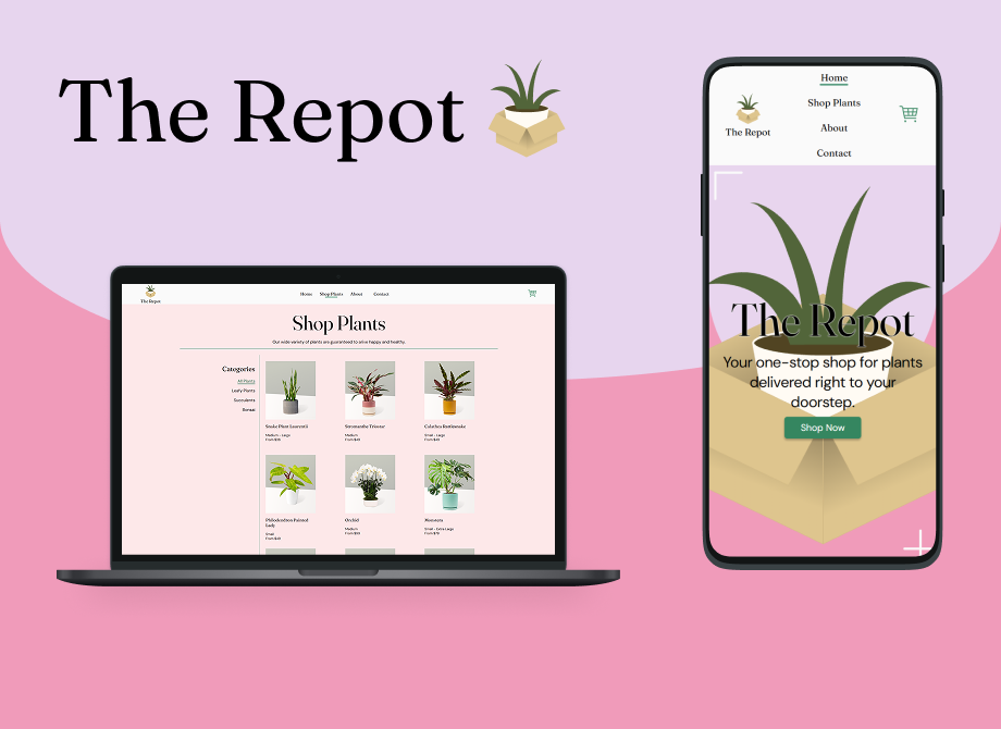
Coding

Going Forward
Takeaways
Impact:
The feedback from peers was that they really liked the color scheme and visual design of the site. The professor noted that he appreciated having “recommended product” sections in the site and the testimonials section to show users what others are saying about their experience with the brand.
What I learned:
I used this project to gain a mastery of responsive coding skills like CSS Grid, Flexbox, and media queries, and dove into a lot of advanced CSS subjects like selectors and pseudo-classes. I also gained an appreciation for how much goes into creating an ecommerce website, especially all the product images and descriptions.
Next Steps
Going forward, I would flesh out more individual product pages and add more products to the listings. I would also add validation to the forms since I’ve learned a lot more about JavaScript and back-end programming since I made this.