Atomic Jarts
Contents
Jump To:
Project Overview
The Project
For this project, the challenge was to make an ad campaign based on Jarts. This project was about using both Photoshop and Illustrator to create a cohesive and seamless ad design, and to design two layout formats: one Print and one Web that both have a cohesive brand identity. We were also to manage the project timeline on our own.
The Product
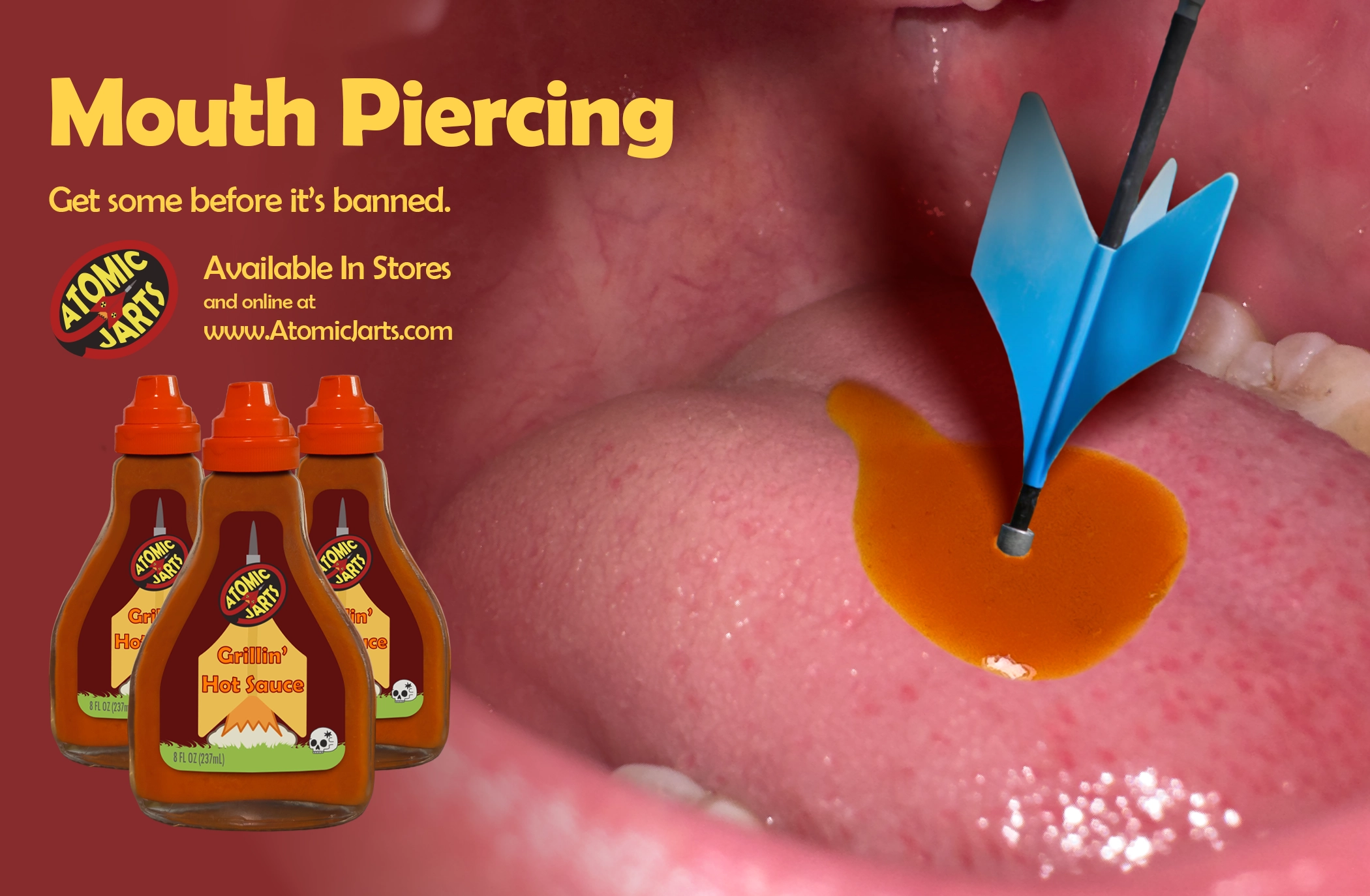
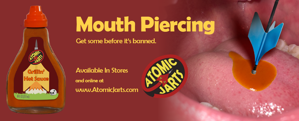
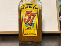
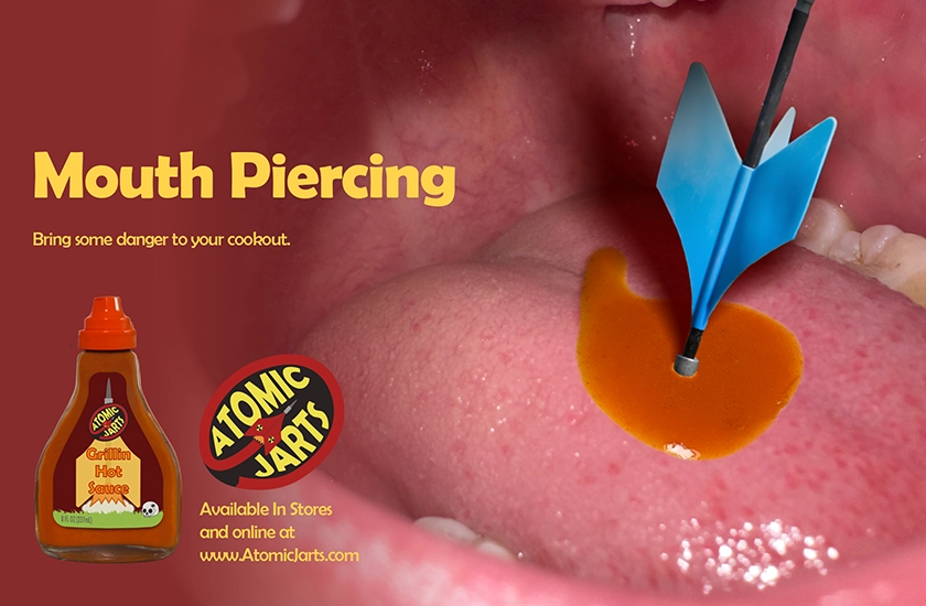
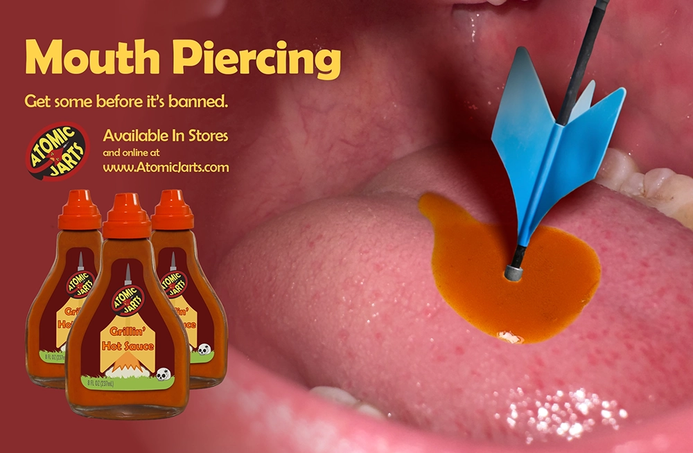
For the Jarts challenge, I came up with a jarts-themed hot sauce called "Atomic Jarts" whose catchphrase is "Mouth-piercingly hot." I made a bottle design and corresponding label in the shape of a Jart.
The Goal
All images were taken by me, except the Jart itself as I didn't have one. Identify a target audience, create a brand and logo for them, and create an ad campaign targeting them.
Project Duration
October - November 2025
Research & Brainstorming
Research & Brainstorming
I started the design process by researching Jarts, their history, and their logo. From there I started brainstorming product and ad ideas. Some notable ideas were: Jarts themed hot sauce, energy drink, Jarts Marketing (target audience), life insurance, thumbtacks, among others. I decided to go with hot sauce.
Competitor Research
From there I started researching hot sauce brand and bottle designs. Overall, most were branded playfully with wacky names and lots of red and yellow. They seem to target an audience with a less mature sense of humor, and usually have a theme of danger, death, or some consequence of being hurt. This fit right in with Jarts.
Target Audience
Next, I identified the target audience for the brand and created personas to represent key user groups.
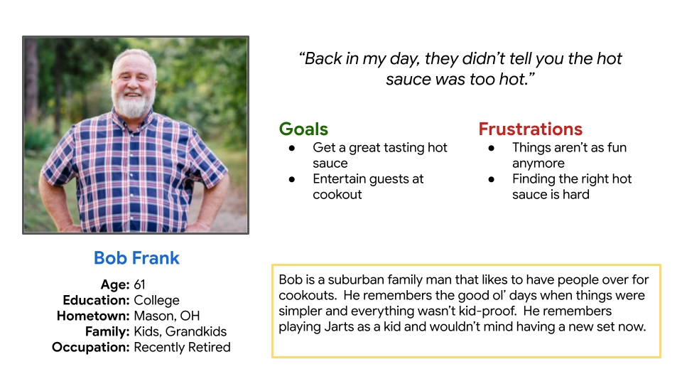
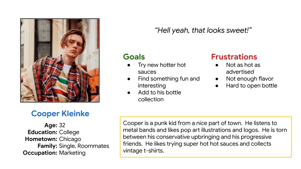
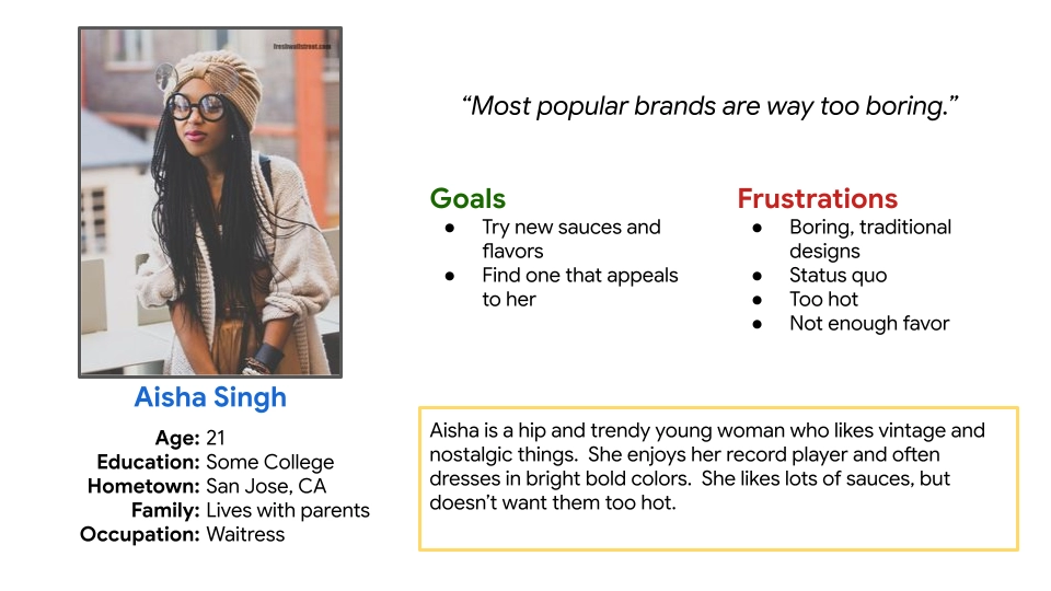
There are two main target segments for the brand. The first is primarily white suburban middle-aged+ dads that enjoy cookouts and remember the 'good ol' days' fondly. The other is younger hip and retro people who like vinyl records and underground music who are into hot sauces. Since the brand is themed on Jarts, it evokes a sense of nostaliga and has a retro aesthetic.
This is a more niche hot sauce, but it will be priced comparatively to mass-market hot sauces, and available at most grocery stores.
Starting the Design
Paper Sketches
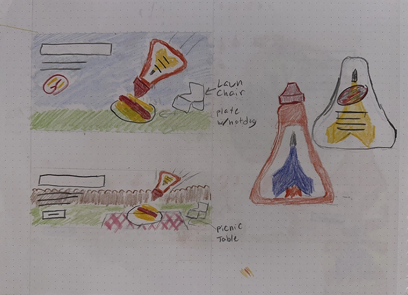
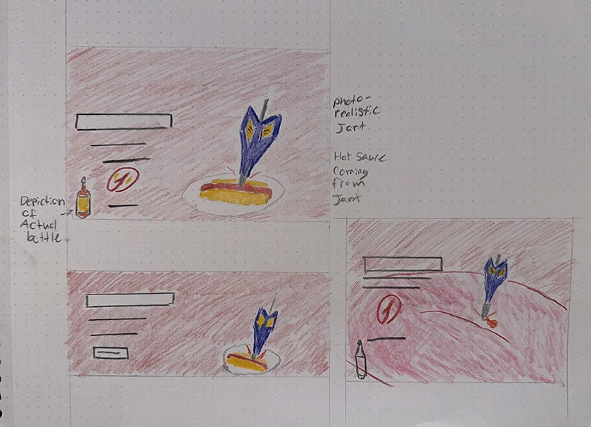
After identifying the product, target audience, and goals, I moved on to preliminary sketches.
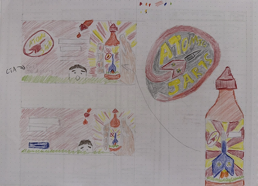
I came up with the brand name "Atomic Jarts" and sketched out bottle, logo, and ad designs. I ended up sketching 6 designs and then presented them for feedback.
The feedback I got was that the designs were a little too tame, and I should increase the danger levels to correspond with Jarts. My instructor liked my last idea because it fit with that theme the best, so I went with that.
Creating The Ad
Photoshop
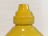
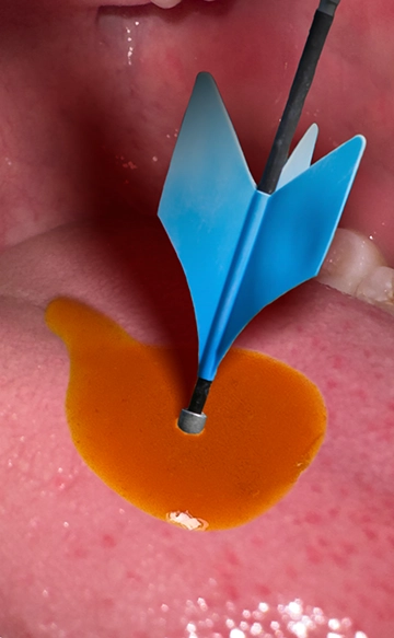
I took all the source images myself, except for the Jart because I don't have any Jarts. once I had the photos, I started compositing them to make the bottle as well as the Jart piercing the tongue with the sauce.
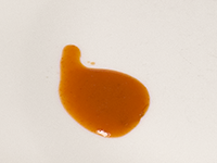
Getting the sauce to look realistic on the tongue was particularly challenging. The drop at the end had to curve along the topography of the tongue the right way.
I used the liquify tool to create the bottle shape, and added the mustard cap on top to create the bottle.

Illustrator
I first created the logo with homage to the original Jarts logo. From there I created the label for the bottle, depicting a nuclear Jart blasting off a front lawn and a punctured skull to the side.
Improvements
I got some feedback from the instructor that the web version looked great, but the layout of the text and logo on the print version could use some improvement. I adjusted the size and number of bottles and moved text around to achieve a better balance.
Final Ad Layouts
Going Forward
Takeaways
Impact:
The instructor and peers thought the idea was cool and liked the bottle design. They thought the jart piercing the tongue was clever. Some initial feedback was that the drop of sauce at the back could point a different direction and the layout of the text could be better, so I made adjustments based on that.
What I learned:
There were a lot of things meant to challenge us with this assignment. I had to get creative to make a product and ad campaign based on Jarts. I had to design an ad that would work in multiple layouts and mediums. I had to use and develop a wide range of skills from marketing to product design to graphic design.
Next Steps
Going forward, I think exploring emphasis typography might be a way to enhance the ad. I might also spend more time on the illustrations and label.