Joker Movie Poster
Contents
Jump To:
Project Overview
Project Purpose
This project was about creating a half-page print ad using only emphasis typography to turn a common phrase into an advertisement.
The Goal
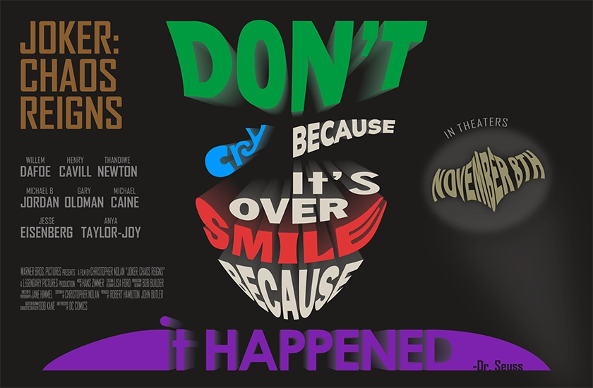
The goal was to turn the phrase "Don't cry because it's over, smile because it happened" into "Don't cry, smile" to represent the Joker's insidious nature in a movie ad.
The Product
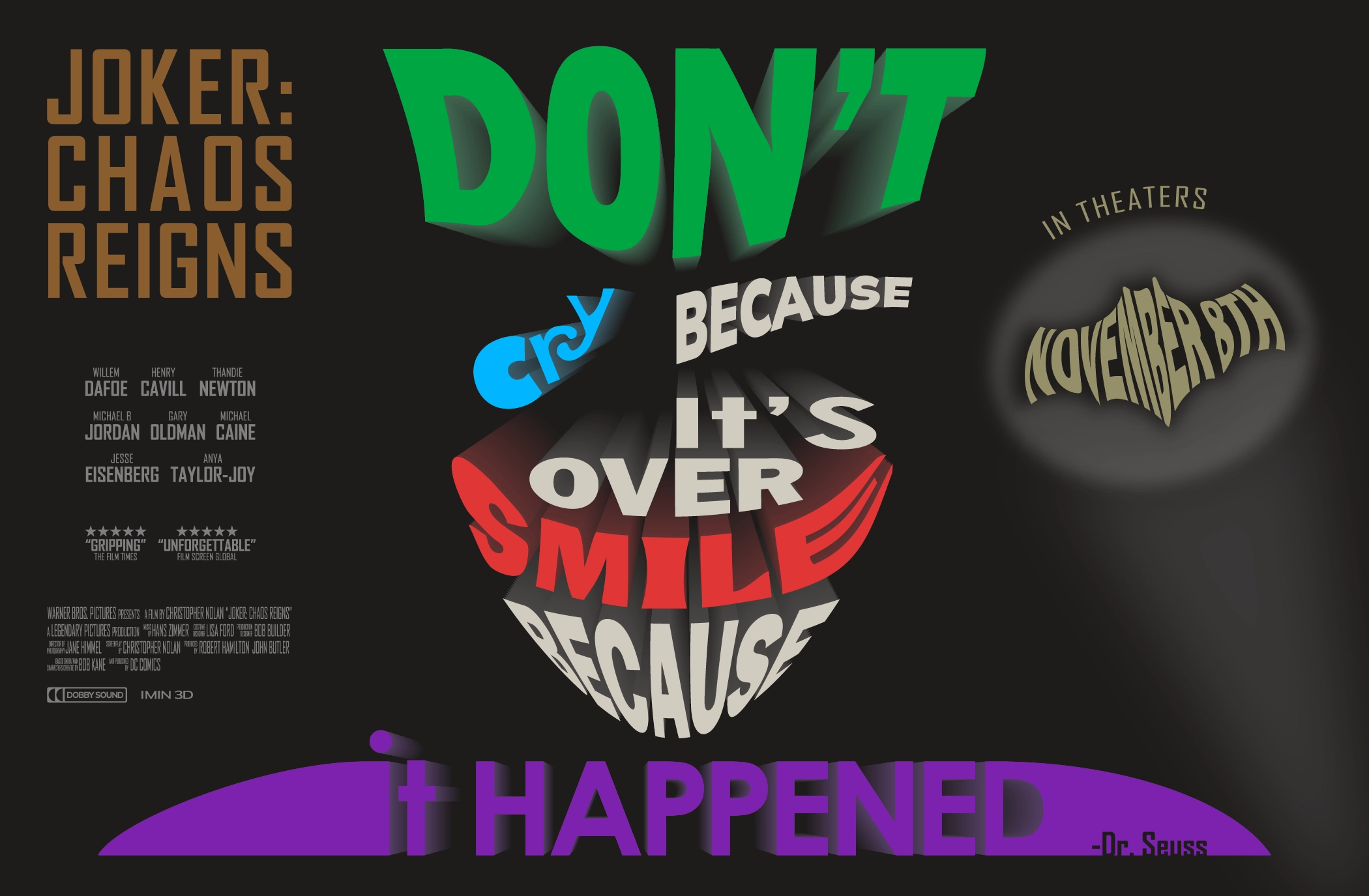
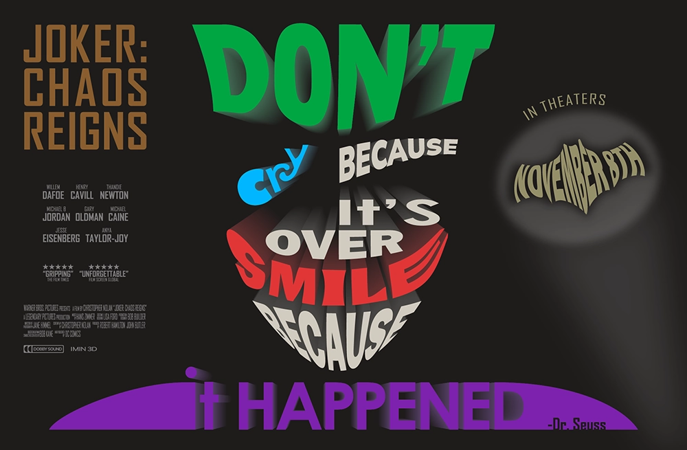
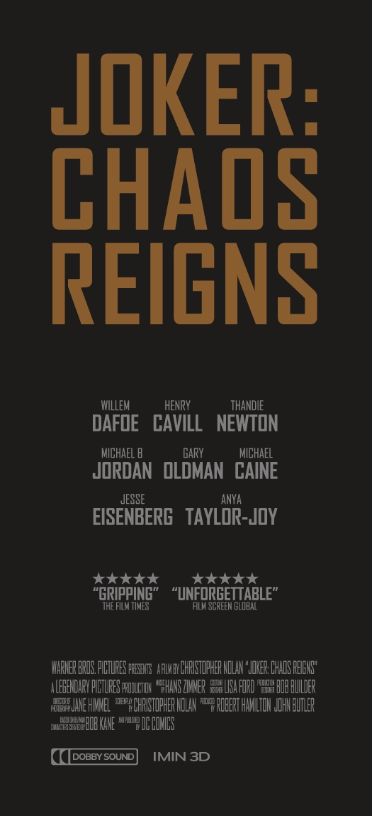
This is a half-page print ad for a Joker movie, in theaters on November 8th.
Project Duration
September 2025
Research & Brainstorming
Research & Brainstorming
The assignment was to use a common phrase together with emphasis typography to create a new or deeper meaning, and turn it into a half-page print ad. I started by researching some common phrases and brainstorming some ideas. This was one of them.
Starting the Design
Paper Sketches
After identifying a few ideas I liked, I drew a paper sketch for each one.
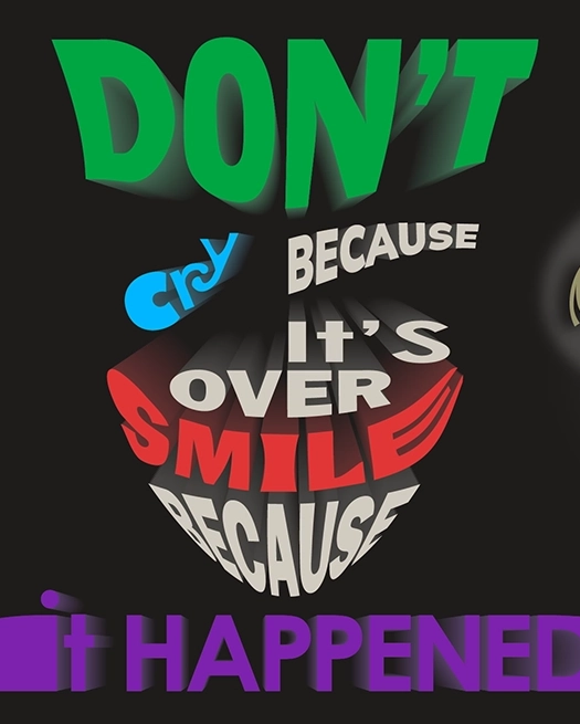
I got the idea to depict the joker using typography and highlight "don't cry, smile" to turn the phrase on its head and show the immature but insidious nature of the Joker. The "Don't" would be his hair, "cry" would be a tear drop, and "smile" would be his actual smile.
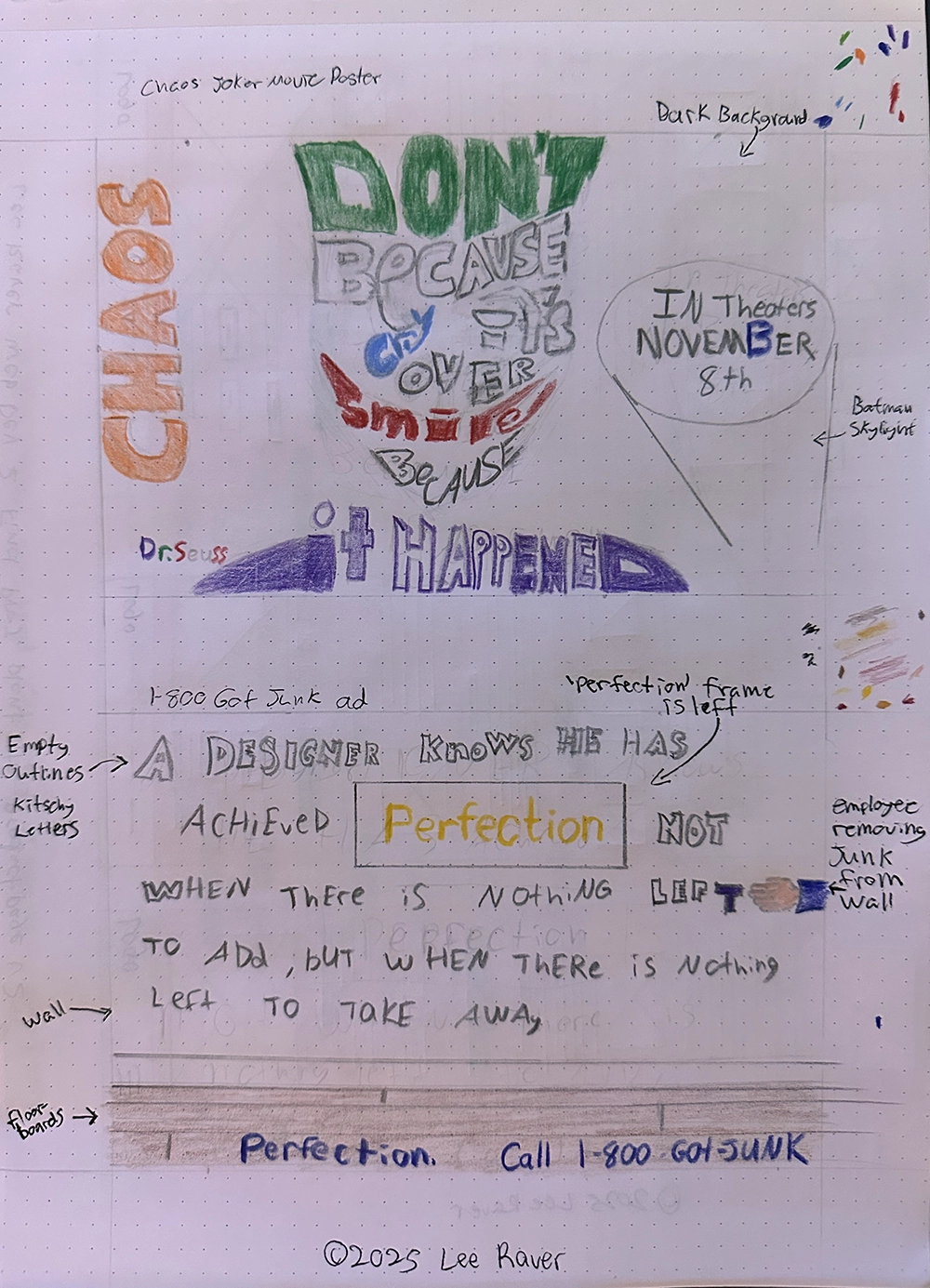
"Chaos" was meant to be the title of the movie and depict the city burning, and the call to action was a bat symbol skylight calling vewiers to see the movie in theaters.
I thought the first idea was much stronger than the others so I went with that.
Creating The Ad
Illustrator
After I finalized the direction for the project, I got started in Illustrator. I started by placing and morphing the phrase in the shape of the Joker.
I used color, brightness, and size to emphasize "Don't cry, smile," and tried to keep the white text making the Joker's face not too bright to not draw attention.
I used various envelope warps to shape the words and letters into the Joker's face, and then used the blend tool to fade the words into the distant background, creating a 3D effect.
Movie Details
Once I had the main Joker phrase designed I started working on the movie details and CTA. I made the title orange to represent burning and chaos, but kept it muted to not distract from the main joker piece.
I came up with a cast and crew and designed them to look like a movie poster. I added some critic reviews to help sell the movie.
For the call to action, I warped November 8th into a bat symbol and used it as a skylight, calling viewers to come see the movie in theaters November 8th.
Improvements
I got some feedback from the instructor that the layout of the details on the left and the general balance could use some improvement. Things weren't lined up on the left, and the left had a lot more going on than the right.
I aligned and scaled the detail text, and then increased the opacity on the skylight to try to balance the piece more.
Final Print Ad
Going Forward
Takeaways
Impact:
The feedback from peers was that the Joker looked great and was obviously the Joker, especially with the 3D effect. They thought the new meaning with the emphasis typography was clever, and liked the bat symbol CTA. The instructor noted that the overall balance of the piece was heavier on the left than the right.
What I learned:
I learned a lot of Illustrator tools and techniques by designing the text, and gained a new appreciation for how emphasis typography can add to a design piece. I also had an "a-ha" moment about how to align and balance text when discussing feedback with the instructor.
Next Steps
Going forward, I think the piece could still use some work balancing the left with the right. I also had some thoughts about adding some skyskcraper illustrations in the background, but that would take away from the typography-only design.