Zombie Movie Poster
Project Overview
The Goal
Use compositing to turn myself into a photorealistic zombie, and then use that imagery to create a product advertisement.
The Product
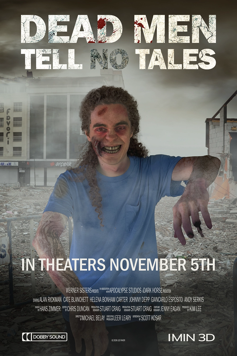
I used the imagery to create a branded movie poster for "Dead Men Tell No Tales," a post-apocalyptic zombie movie.
My Role
Research, brainstorming, creating the brand, Photoshop work.
Project Duration
March 2025, Updated February 2026
Research & Brainstorming
Research & Brainstorming
The assignment was to create a photorealistic composited image of me as a zombie, and then turn it into a branded product. I started the design process by researching various zombie themed products and brainstorming ideas, and decided to go with a zombie movie.
Movie posters usually have a lot of details in small text and some logos for production companies, so made sure to include those in my design.
Creating The Ad
Photoshop
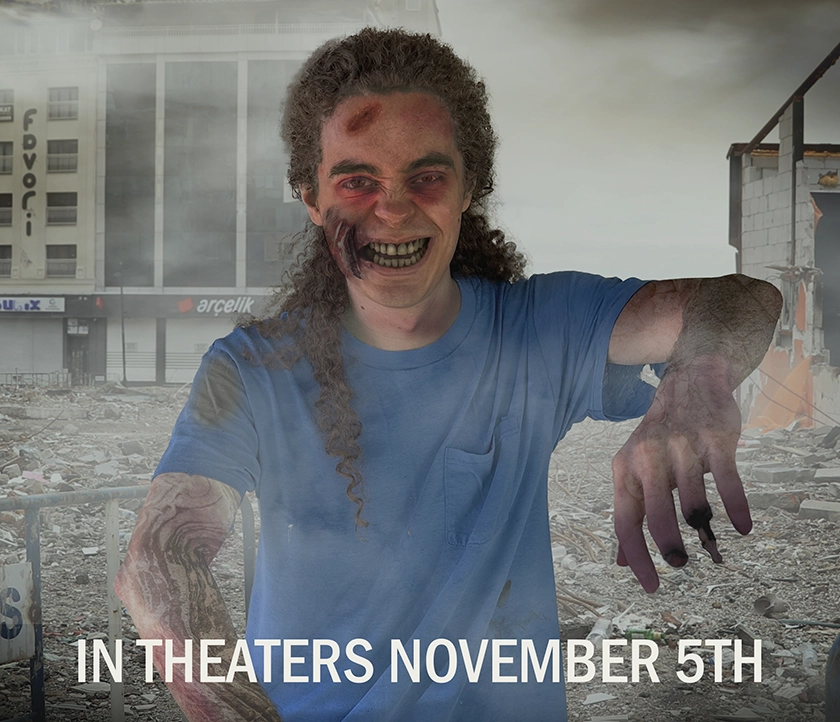
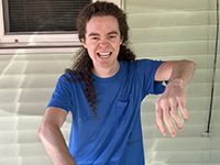
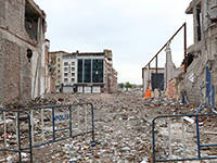
After I finalized the direction for the project, I tooke a picture of myself posing as a zombie and started gathering source images to make the poster out of. These included stone textures, blood splats, and the background image.

Once I got the images I started masking them out and piecing them together in photoshop. Some feedback I got on my first iteration was that the stone crack texture didn't look realistic, the face and left hand could look gnarlier, and there was too much fog in front of the zombie.
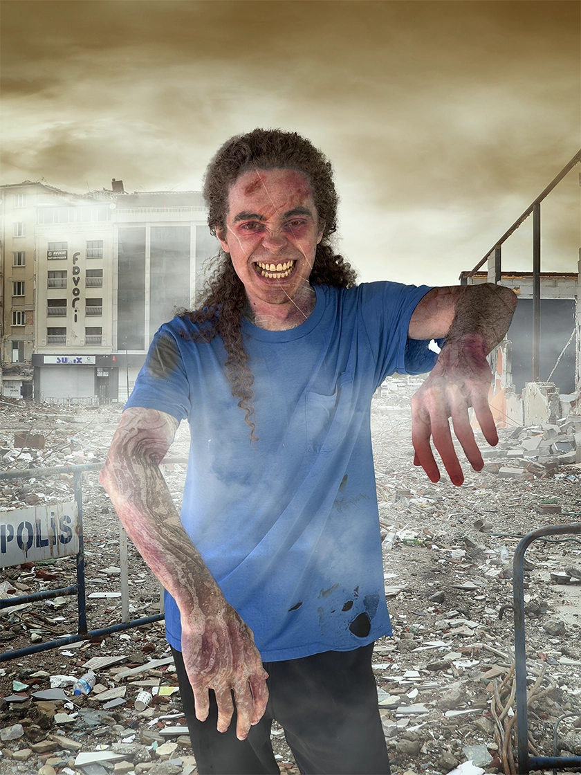
I put some more detail into those sections to make them look more zombie-like, and added some shading to make the overall piece look more "cinematic."
Typography
For the title, I used emphasis typography to de-emphasize the "no," turing "Dead Men Tell No Tales" to "Dead Men Tell Tales," nodding to the living dead.
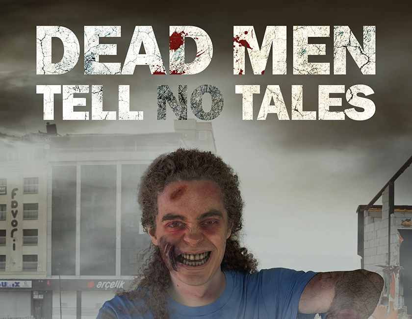
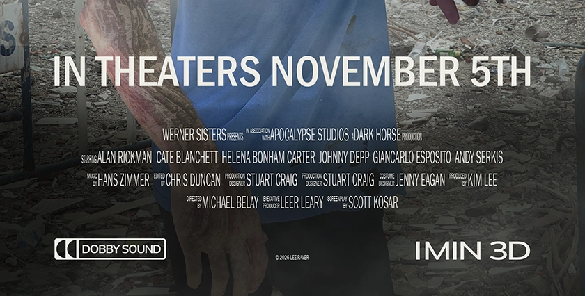
I added movie details to the bottom of the poster such as a call to action, the cast and crew, and some movie production logos.
Final Poster Ad
Going Forward
Takeaways
Impact:
The feedback from peers was very positive, commenting that the zombie looked very zombie-like. One person noted the "no" was a little hard to read, so I made it a little darker, and the professor suggested I change the proportions to movie poster dimensions, so i did that as well.
What I learned:
This was my first big compositing project in photoshop, so I gained a lot of skill in that area through this project. I also learned a lot about getting the lighting and general aesthetic to be cohesive.
Next Steps
Going forward, I would probaly add some more logos and production details to the bottom to solidify that movie poster look.