Goopa Skincare
Contents
Jump To:
Link to Website:
Project Overview
The Project
Biuld an ecommerce website with fully functioning interactive JavaScript - form validation, a functioning cart, interactive sliders, a countdown to a sale, DOM maniputlation, and more.
The Product
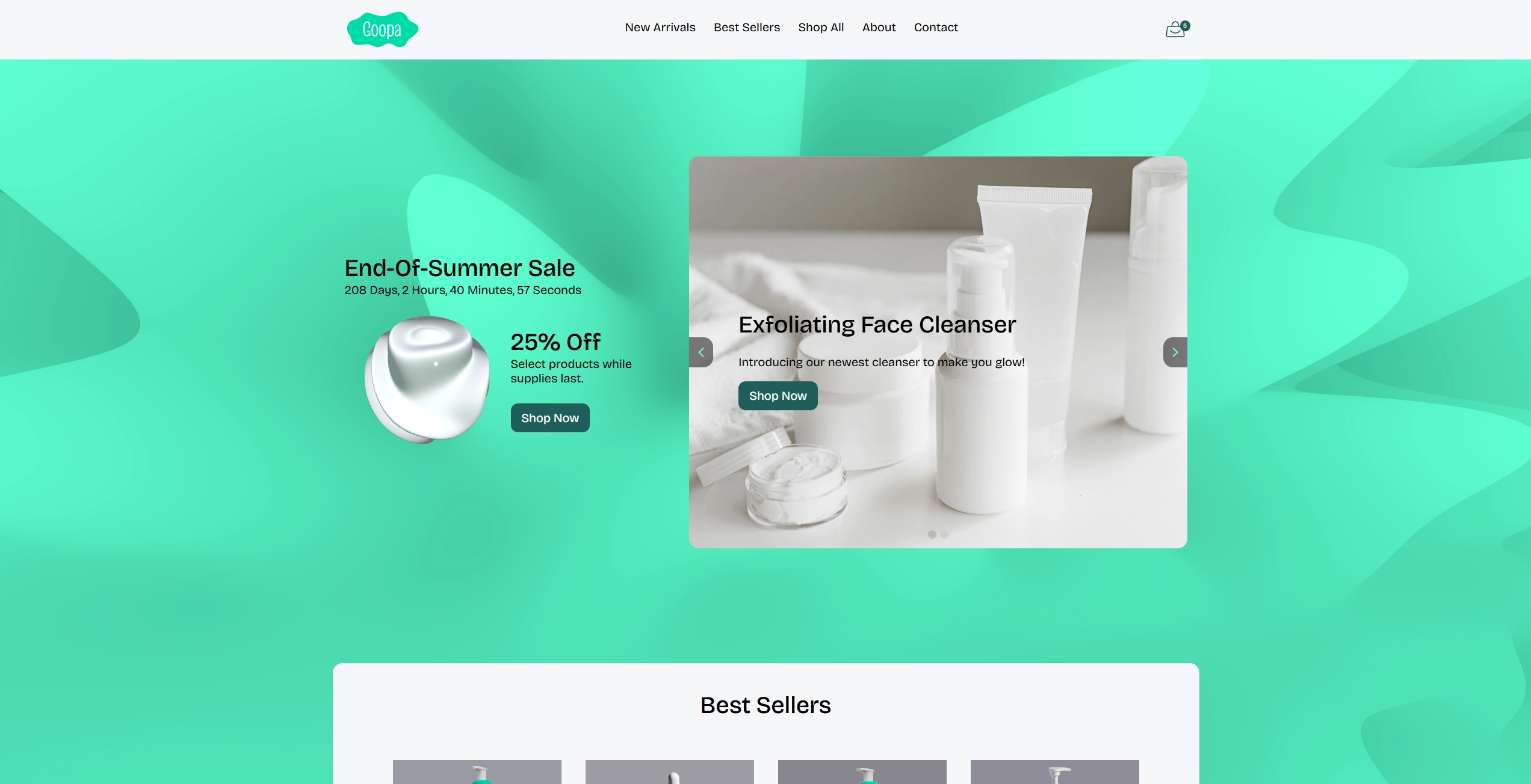
Goopa is a new skincare brand focusing on dermatologist tested solutions for sensitive skin. Goopa markets themselves to all genders and is positioned to be a good everyday moisturizer for the average person, rather than a niche luxury brand. Goopa's branding is fun and trendy with bright seafoam greens and bubbly shapes.
The Goal
First, design the brand, target audience, logo, and products. Then design and build a fully responsive ecommerce website using JavaScript to make everything functioning and interactive.
Project Duration
September - December 2025
Understanding the User
Competitor Research
I first had to create a brand, then design a website for the brand. I started
by brainstorming some ideas for ecommerce brands and chose a skincare brand.
I first researched other skincare brands to see how they brand and position themselves,
what kinds of products they sell, and what kind of features they have on their sites.
While most of the brands had a wide range of branding styles, most fell into two categories:
"all natural" and "clinically proven." Their sites also had a lot of sections touting the
benefits of specific ingredients, dermatologis recommended sections, and sections about the
benefits of the product.
Target Audience
Next, I identified the target audience for the brand and created personas to represent key user groups.
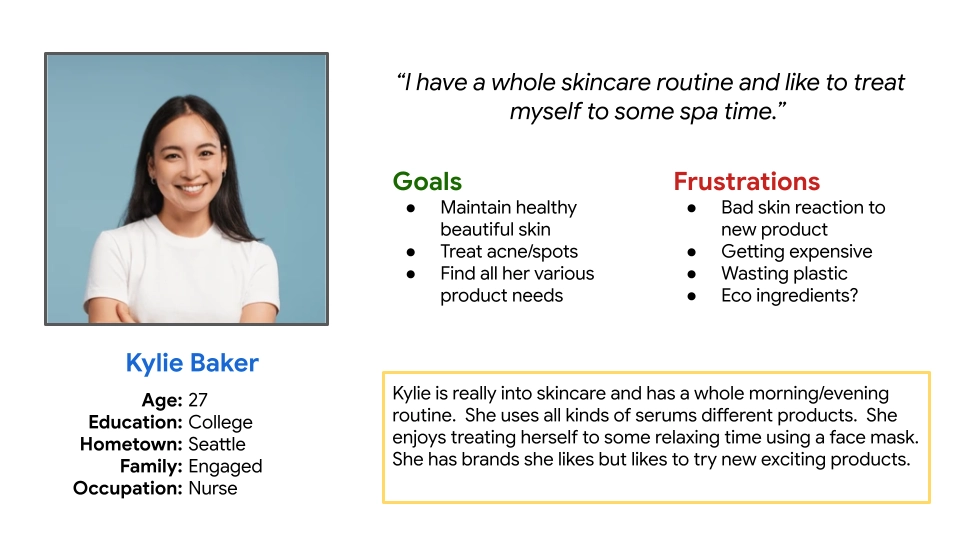
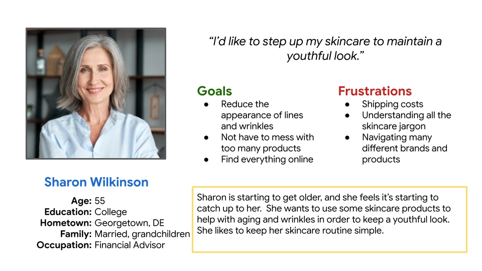
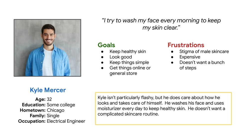
While women buy the majority of skincare products, the brand is trying to appeal to anyone regardless of sex, so the visual style should appeal to women, but not be offputting to men. The primary target audience is younger people with sensitive skin looking for an affordable daily moisturizer, but other segments include older women looking for anti-aging solutions, and men looking for an everyday facewash.
Starting the Design
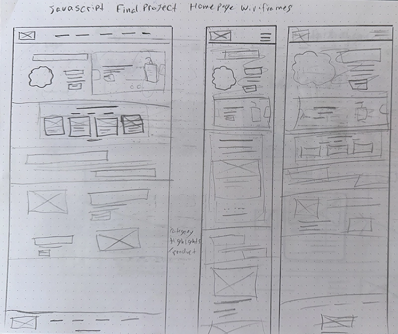
Paper Wireframes
After researching, empathizing with the user, and defining goals, I moved on to sketching my designs. I started by sketching quick wireframes on paper to get all my ideas down and see which ones I liked.
Refining the Design
Hi-Fi Sketches
Next I created high-fidelity sketches in Figma to nail down the finer details.
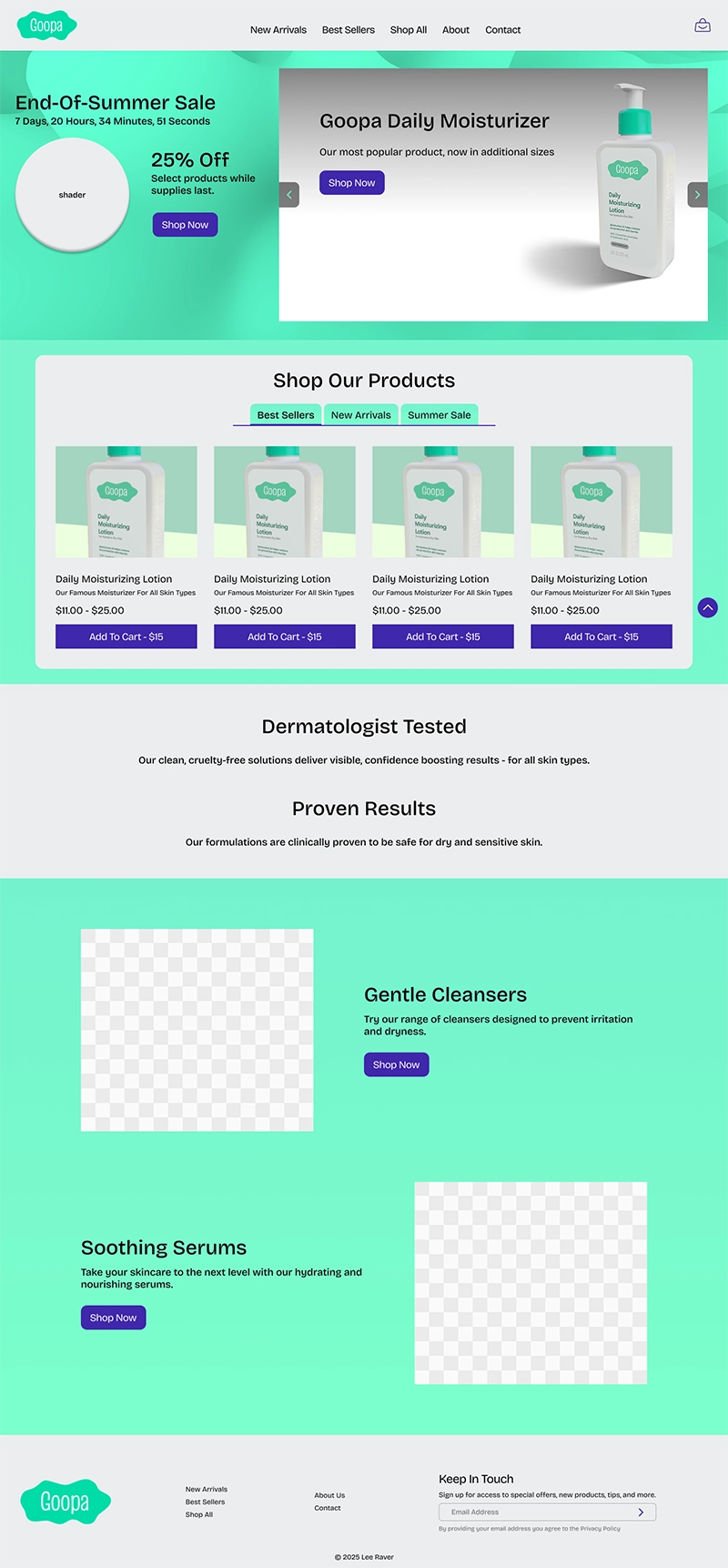
Going back to the competitor research, I designed the site to be unique and stand out, with a bright, bold color scheme and fun visuals. Using seafoam green in an ecommerce website turned out to be quite the challenge because of contrast.
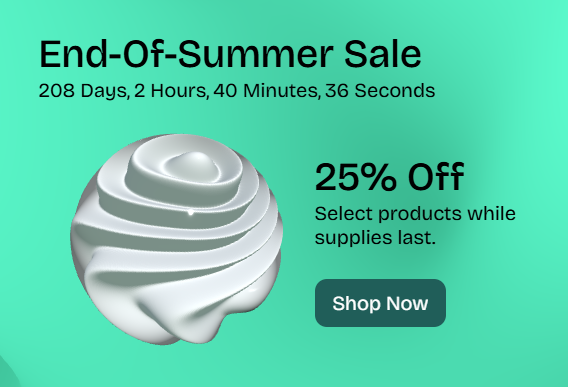
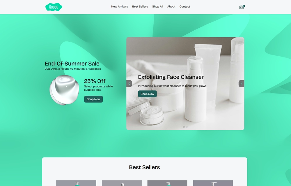
I used ThreeJS and shaders to create a depiction of a blob of moisturizer to add a bit of delight for the user and help them remmember the brand. I also created a moving gradient shader background for the home page.

I got some feedback that the blue I was using as an accent color in my original design wasn't consistent with the brand color scheme, so I switched to a darker green accent color.
Coding
View Site
While making this site I learned a lot about JavaScript DOM manipulation, interactivity, and validation. I also explored some libraries like ThreeJS and GSAP to create some cool visuals.
Goopa Skincare


Goopa
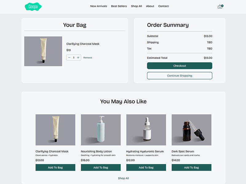
I used JSON and localStorage to create a fully functioning cart system where you can add to and remove from your cart. The subtotals, tax, and totals update dynamically and are saved throughout checkout.
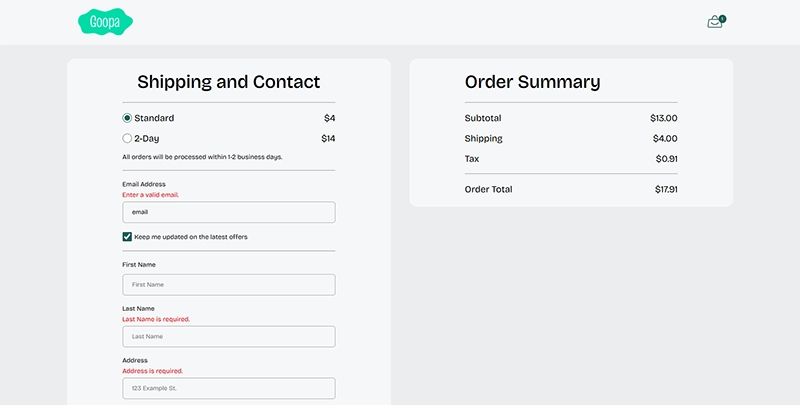
I created a checkout system that is fully validated, and even validates when the user leaves the textbox. I added a button to autofill the forms for ease of use while viewing the project. I used a "secure checkout" approach to prevent accidental navigation during checkout.
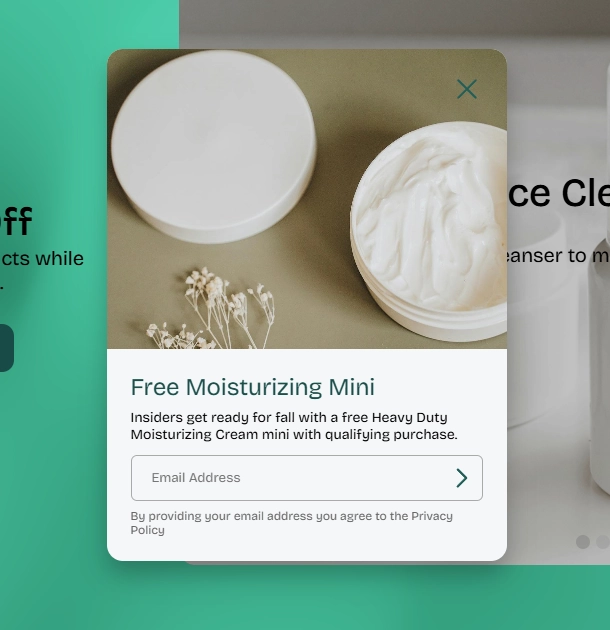
While I personally think popups are terrible UX, a popup was part of the requirements, and so I tried to make one that is as least annoying as possible and doesn't limit usability.
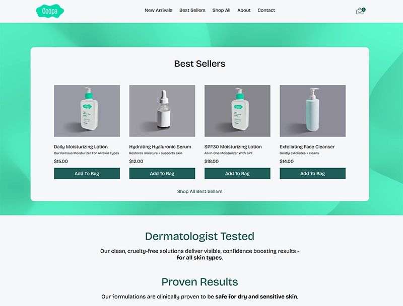
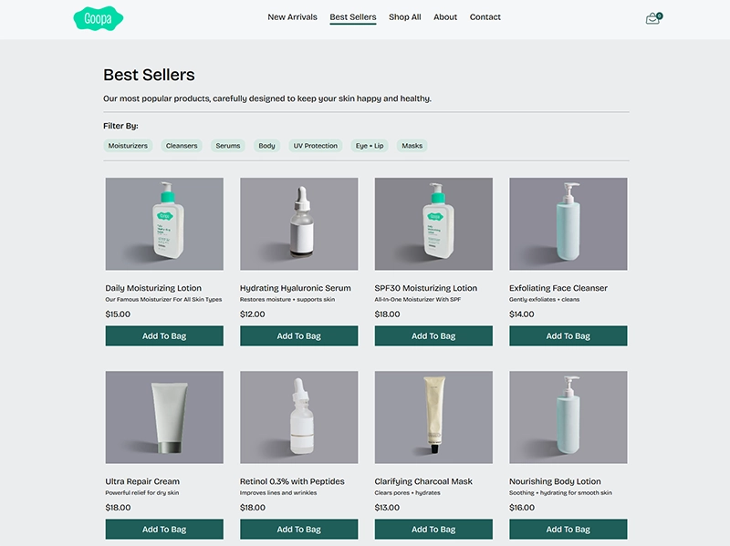
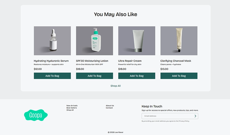
I used recommended and "you may also like" sections to help customers discover more products they may be indterested in.
Going Forward
Takeaways
Impact:
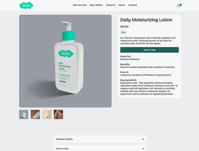
Users were very impressed with the shaders and visuals on the home screen and liked the bold color scheme. Some initial feedback was that the blue accent color wasn't cohesive with the brand color, so I changed it. Some people also noted that some of the pages could use more content, like the product page.
What I learned:
I learned a whole lot about JavaScript while making this project, from validation to array processing to DOM Manipulation and interactivity. I also learned that some colors are very difficult to pull off, like light seafoam green against a white background. Also, it's the little things like well thought out copy, images, and typography that really make a website look professional.
Next Steps
Going forward, I would probably flesh out some of the details on the product pages a little more. I also wanted to do custom labels in photoshop for all of the products, but I ran out of time for that.