Moo-V
Contents
Jump To:
View It:
Project Overview
The Goal
Design a responsive website for Moo-V that allows users to easily browse movies and purchase tickets online.
My personal goal was to develop more advanced skills in Figma design and prototyping.
The Product
Moo-V is a new movie theater franchise competing with the likes of AMC, Cinemark, and Regal. They need a website so their customers can browse and purchase movie tickets online.
The Project
Interview users, create working prototypes in Figma, and test the designs with usability studies. Then code the site using React.
Project Duration
Design: March - May 2024
Code: February to March 2026
Understanding the User
Competitor Research
I conducted a competitive analysis on major competitors such as AMC, Cinemark,
etc. to gain an understanding of their brand and products.
I also conducted user interviews where I had users interact with the competitors'
products and asked about their thoughts on the products and their past experiences.
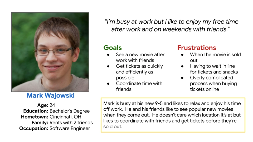
Two user groups I identified were young adults wanting to buy specific tickets as fast and efficiently as possible and (older) people with free time looking to see available movies.
I figured the competition would have good products, but I found tht they all had a poor user experience. User interviews confirmed this. This surprised me and I realized I could make a better product than the competition, which became my goal.
User Research: Pain Points
Most competitors' websites were too busy and cluttered.
Pages and structure was too complicated.
Pop-ups in competitors' sites were a huge frustration.
Small text was a struggle for some users.
Target Audience
Next, I identified the target audience for the brand and created personas to represent key user groups.
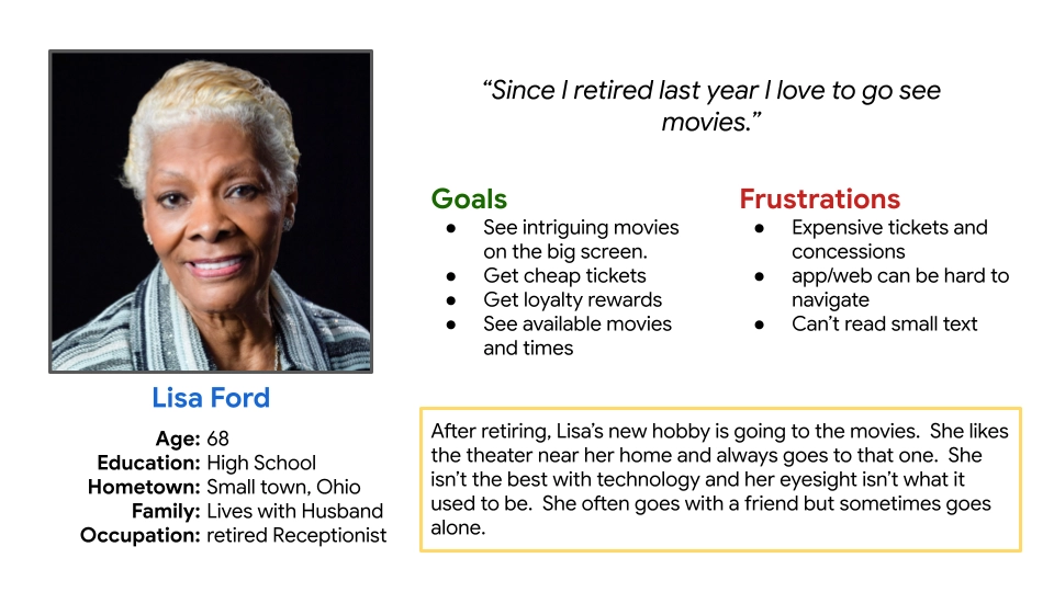
Mark is a young busy professional that just wants to get in and get out to buy tickets as fast as possible. Lisa might take her time and brows new and upcoming movies, and would appreciate a rewards program.
Starting the Design
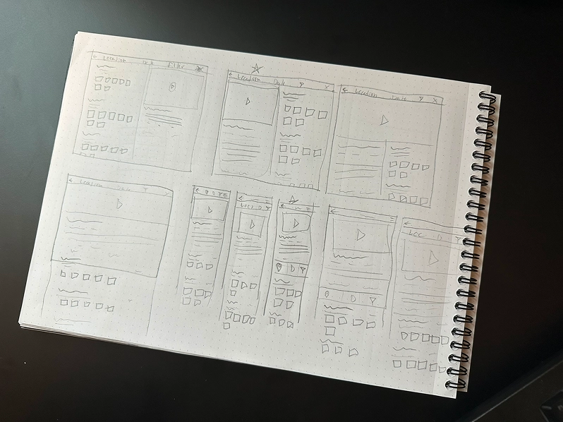
Paper Wireframes
First I sketched a few iterations of each page and then combined what I liked into a final version for each screen size. I used my user research and competitive audit to inform my designs.
Digital Wireframes
As the initial design phase continued, I made sure to base my designs on feedback from user research.
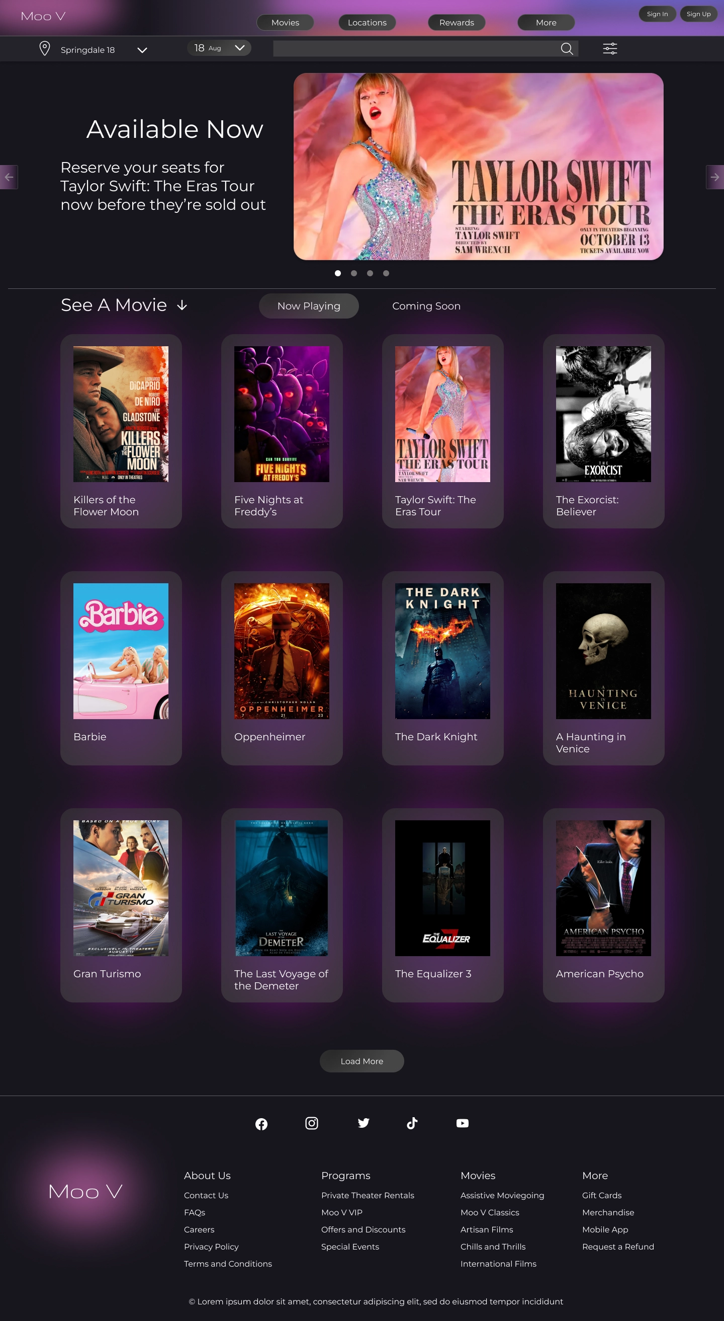
I tried to keep it as simple and clean as possible.
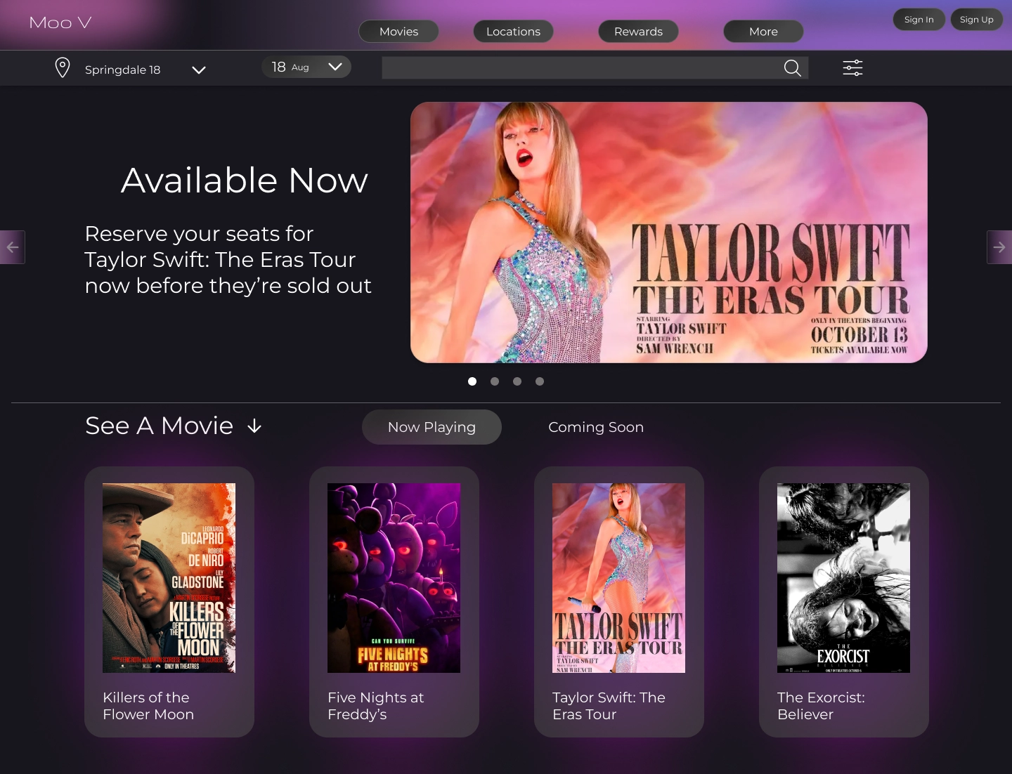
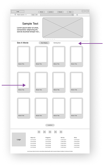
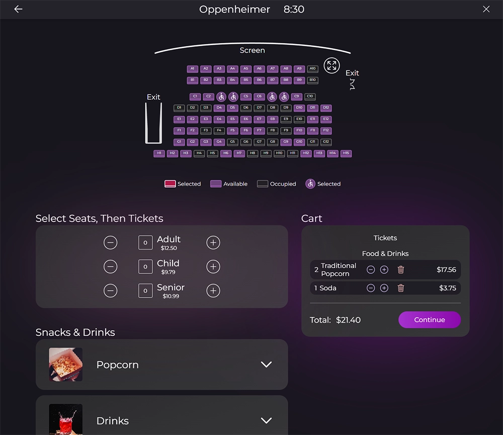
Movie selection is the home page because that is what most users are here for.
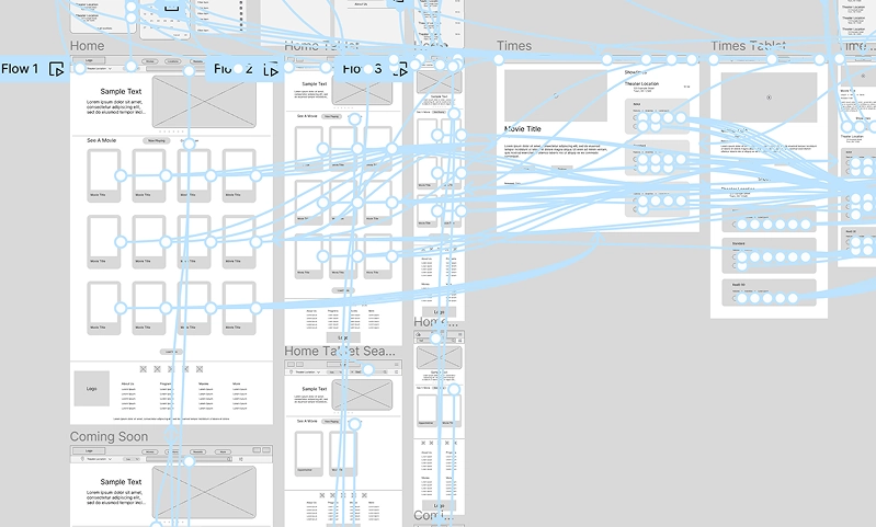
One of my goals was to condense the user flow into the least amount of screens so it would be fast and easy.
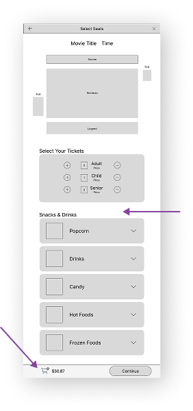
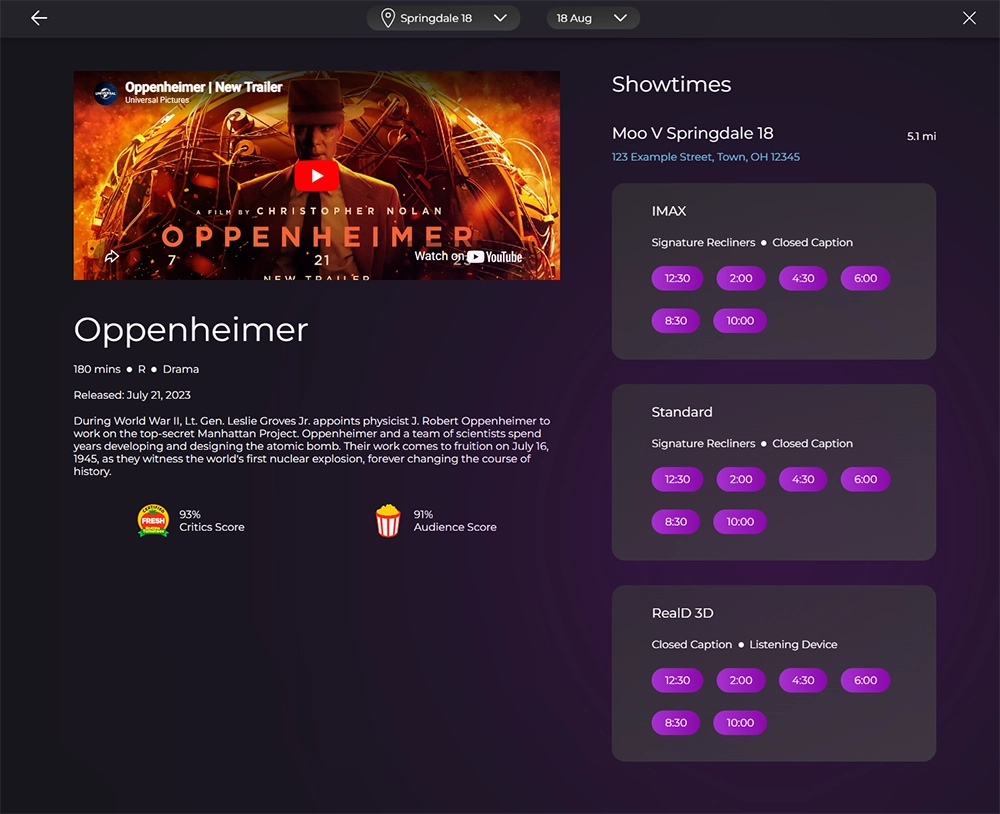
Users pick their seats and order food on the same page to avoid shuffling between pages.
Users can view everything in their cart from the same screen.
Low-fidelity Prototype
I created a Low-fidelity Prototype which turned the designs into something users could interact with.
I then conducted a usability study to test the designs.
Usability Study: Findings
I conducted two rounds of usability studies. Findings from the first study helped guide the designs from wireframes to mockups. The second study used a high fidelity prototype and revealed what aspects of the mockups needed refining.
Round 1 Findings
Some users didn't know to scroll down on the home page.
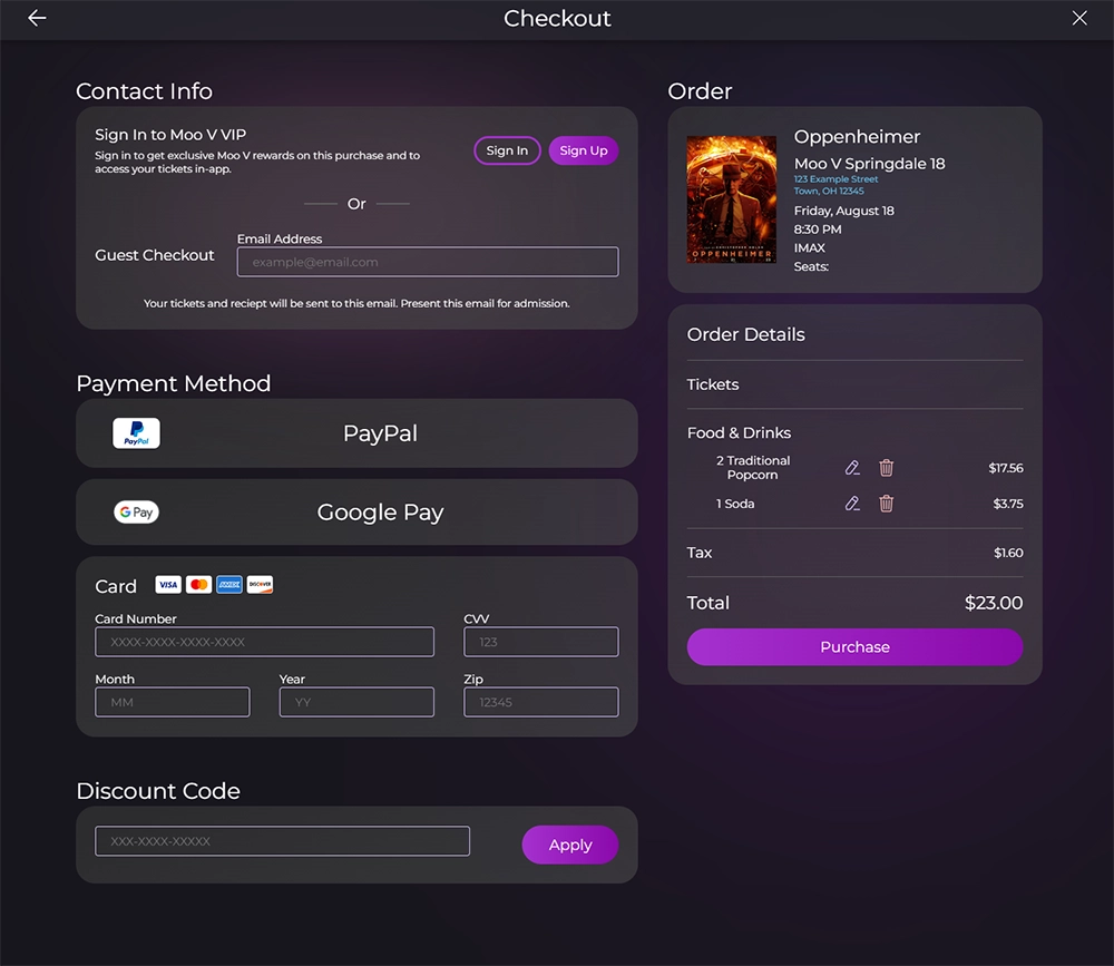
Users wanted “guest checkout” to be more obvious.
Users liked the initial design.
Round 2 Findings
Some users still didn't think to scroll down on the home page.
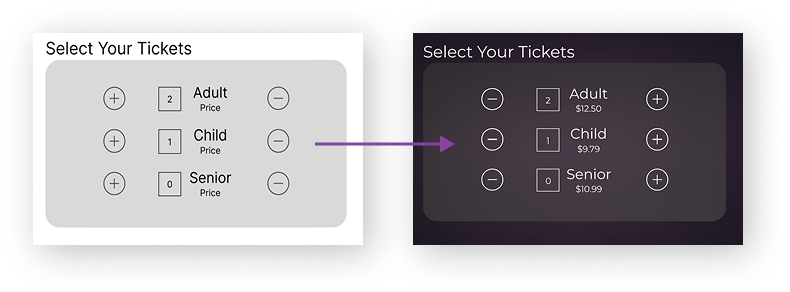
Having "-" on the left and "+" on the right would feel more natural.
Some users didn't notice that they could expand the seatmap.
Refining the Design
Mockups
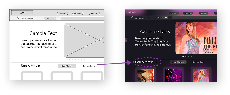
I went with a purple color scheme to provide a soothing feeling to go with the
nighttime moviegoing experience. I also added mesh-gradient-style backgrounds behind
important features to draw the eye as well as add visual interest.
I thought adding color and moving things above the fold would help users know to scroll,
but they still had trouble. I added an arrow to help them know to scroll.
Some users noted that they would prefer the "+" and "-" signs be switched.. They didn't mind the way it was, but it felt unnatural and they would click the wrong buttons sometimes.
High-fidelity Prototype
The High-fidelity Prototype was used for user testing and is a working version of the final product.
View Hi-Fi Prototypes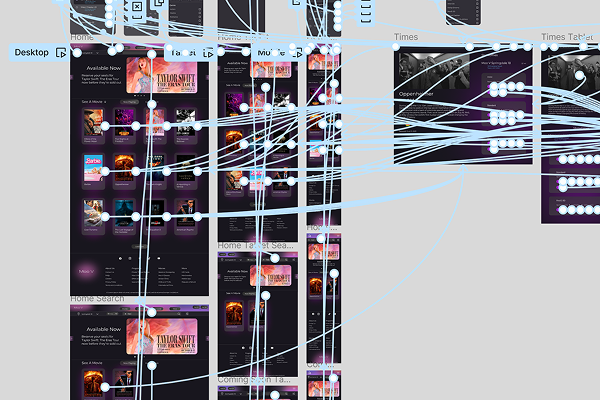
Coding
View Site
I was teaching myself React, and I thought this design would be a good use case for a Single Page Application, so I coded it in React. It was a challenge, but it taught me a lot about React and modern frameworks.
Moo V Website


Moo V
Going Forward
Takeaways
Impact:
One of my goals was to create a better product than the competition, since they had a lackluster UX. The users who participated in my research said they really liked my website and that they liked it way more than companies like AMC and Cinemark after comparison.
What I learned:
On this project I wanted to get into more advanced Figma stuff and I learned a lot in that regard. I also learned not to take anything for granted like assuming users will scroll down the page. It was also a major learning experience with React.
Next Steps
Going forward I would conduct a new round of research after iterating on my Hifi Prototype to see if my alterations were successful. I could also begin work on other user flows within the website, as this is just the main user flow.